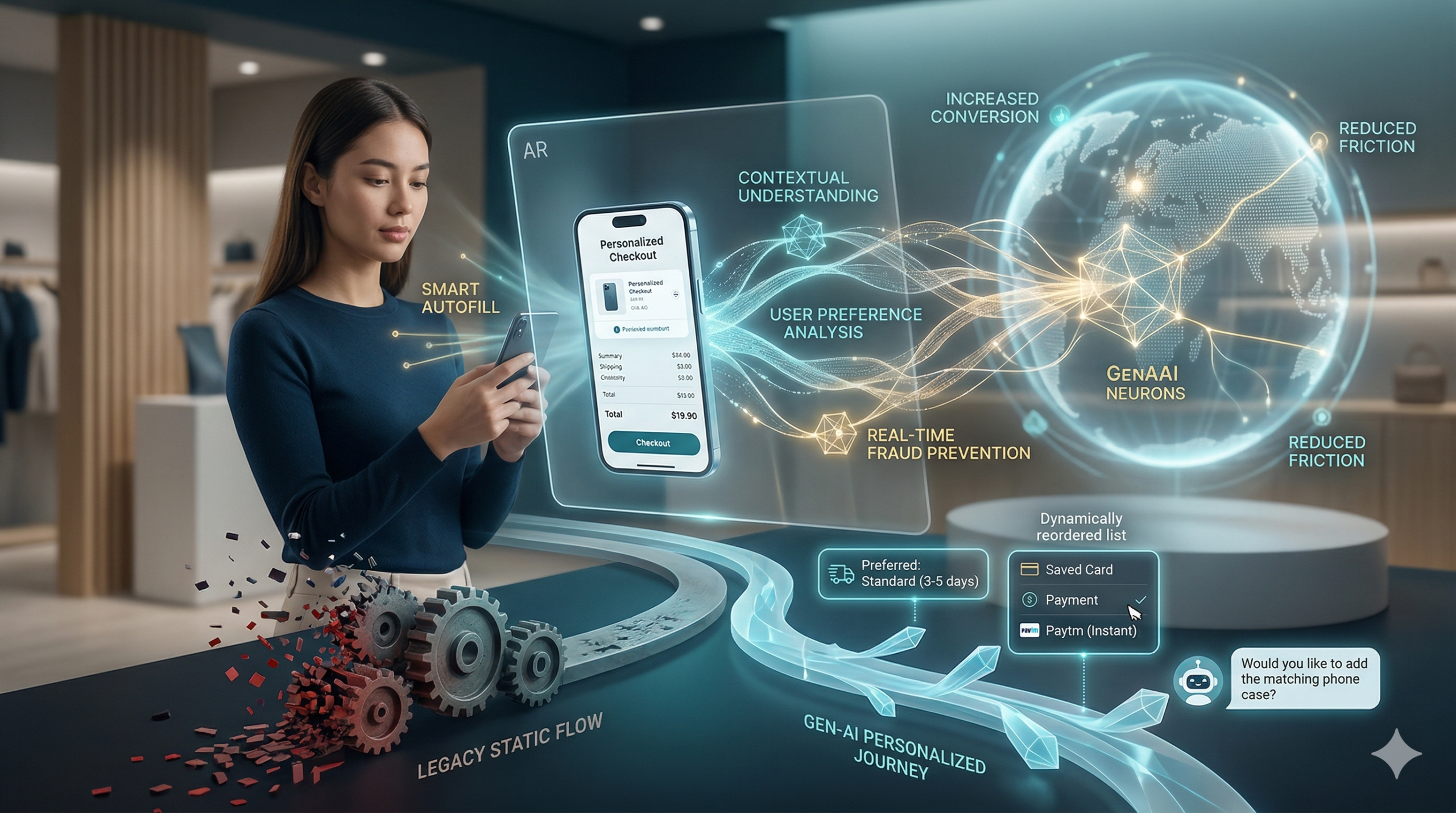
Most online stores lose customers at the final step because traditional checkout pages are often slow and boring. Now, generative ai is changing that forever by creating a personal path for every shopper. Because this technology learns what you like and how you want to pay, buying things online is faster than ever. Furthermore, smart stores use generative ai to turn one-time shoppers into loyal fans. This shift is vital for any brand that wants to grow. Consequently, the payment journey is no longer just a task; it is an experience.
Why Old Checkout Systems Fail
Static forms are the biggest enemy of sales because most shops show the same fields to everyone. Consequently, many people leave their carts empty. This is because the process feels long and hard. Generative ai solves this by making every page unique for the user. For instance, it knows if you are on a phone or a laptop. Furthermore, it predicts which payment method you prefer. Therefore, you spend less time typing and more time enjoying your purchase. In short, ai removes the friction that kills sales.
Real-Time Help with Generative AI
Shopping can sometimes feel confusing, especially when you have questions about shipping or taxes. Standard help pages are often hard to find. However, ai adds a smart assistant to the page to guide you. This bot answers your questions in seconds. Because the bot knows your cart, it gives perfect advice. This builds trust and keeps you moving forward. In addition, ai makes sure you never feel alone while shopping.
Moreover, these bots can offer special deals at the perfect moment. If you hesitate, the generative ai might give you a small discount to help you decide. As a result, shoppers feel valued and safe. Generative ai is not just a tool; it is a digital guide. Because of these benefits, top brands are moving to AI today. Therefore, the checkout flow becomes a conversation instead of a form.
Safer and Faster Payments
Security is the most important part of any sale because hackers are always looking for ways to steal data. Luckily, ai is great at spotting fraud by looking at millions of data points in real-time. If it sees something odd, it stops the threat fast. This keeps your money and data very safe. Because the ai is so smart, it rarely blocks real customers. Thus, generative ai makes payment security much stronger for everyone.
Additionally, generative ai helps with filling out forms by guessing your address with high accuracy. This reduces errors and saves time for the customer. When you use generative ai, the checkout flow feels like magic. You just click and go. Therefore, the risk of a mistake is very low. This is the future of ai in the payment world. Finally, this technology ensures that safety does not come at the cost of speed.
The Big Future of Generative AI
We are only at the start of this change. Soon, every store will use ai to talk to us. It will know our size, our style, and our budget. This means we will see fewer ads we do not like. Instead, we get a tailored world of products. Generative ai makes every transaction feel human. It is the best way to shop in 2026. If you want to stay ahead, you must use generative ai now. In conclusion, the personalized payment journey is the new standard for global trade.
Frequently Asked Questions
1. Is generative ai safe for my credit card?
Yes, it improves security by spotting fraud much faster than older systems.
2. Does generative ai make my phone slow?
No, most of the work happens on fast servers, so your phone stays quick.
3. Why do stores need ai?
It helps them sell more by making the checkout process easy and personal for everyone.
4. Can generative ai help with returns?
Yes, it can guide you through the return process and answer policy questions instantly.
5. Will all stores use generative ai soon?
Yes, it is becoming the global standard for all top e-commerce websites.
Most online stores lose customers at the final step because traditional checkout pages are often slow and boring. Now, generative ai is changing that forever by creating a personal path for every shopper. Because this technology learns what you like and how you want to pay, buying things online is faster than ever. Furthermore, smart stores use generative ai to turn one-time shoppers into loyal fans. This shift is vital for any brand that wants to grow. Consequently, the payment journey is no longer just a task; it is an experience.
Why Old Checkout Systems Fail
Static forms are the biggest enemy of sales because most shops show the same fields to everyone. Consequently, many people leave their carts empty. This is because the process feels long and hard. Generative ai solves this by making every page unique for the user. For instance, it knows if you are on a phone or a laptop. Furthermore, it predicts which payment method you prefer. Therefore, you spend less time typing and more time enjoying your purchase. In short, it removes the friction that kills sales.
Real-Time Help with Generative AI
Shopping can sometimes feel confusing, especially when you have questions about shipping or taxes. Standard help pages are often hard to find. However, generative ai adds a smart assistant to the page to guide you. This bot answers your questions in seconds. Because the bot knows your cart, it gives perfect advice. This builds trust and keeps you moving forward. In addition, it makes sure you never feel alone while shopping.
Moreover, these bots can offer special deals at the perfect moment. If you hesitate, the generative ai might give you a small discount to help you decide. As a result, shoppers feel valued and safe. It is not just a tool; it is a digital guide. Because of these benefits, top brands are moving to AI today. Therefore, the checkout flow becomes a conversation instead of a form.
Safer and Faster Payments
Security is the most important part of any sale because hackers are always looking for ways to steal data. Luckily, generative ai is great at spotting fraud by looking at millions of data points in real-time. If it sees something odd, it stops the threat fast. This keeps your money and data very safe. Because the generative ai is so smart, it rarely blocks real customers. Thus, it makes payment security much stronger for everyone.
Additionally, it helps with filling out forms by guessing your address with high accuracy. This reduces errors and saves time for the customer. When you use it, the checkout flow feels like magic. You just click and go. Therefore, the risk of a mistake is very low. This is the future of generative ai in the payment world. Finally, this technology ensures that safety does not come at the cost of speed.
The Big Future of Generative AI
We are only at the start of this change. Soon, every store will use generative ai to talk to us. It will know our size, our style, and our budget. This means we will see fewer ads we do not like. Instead, we get a tailored world of products. It makes every transaction feel human. It is the best way to shop in 2026. If you want to stay ahead, you must use generative ai now. In conclusion, the personalized payment journey is the new standard for global trade.
Frequently Asked Questions
1. Is generative ai safe for my credit card?
Yes, it improves security by spotting fraud much faster than older systems.
2. Does generative ai make my phone slow?
No, most of the work happens on fast servers, so your phone stays quick.
3. Why do stores need generative ai?
It helps them sell more by making the checkout process easy and personal for everyone.
4. Can generative ai help with returns?
Yes, it can guide you through the return process and answer policy questions instantly.
5. Will all stores use generative ai soon?
Yes, it is becoming the global standard for all top e-commerce websites.
Every business wants loyal customers. Therefore, you must look at your checkout process. Often, the payment step is where people leave. But, a smooth experience changes everything. Truly, it makes shoppers feel safe and happy.
Some shops have very slow payment pages. Consequently, they lose money every single day. Always remember, ease of use is a competitive edge. By making payments fast, you show respect for the user. This builds a bond that lasts a long time. It also helps your brand stand out from others. This simple focus leads to much higher sales over time.
The Payment Pain Point: Why Checkouts Fail
First, let us talk about why customers quit. A hard checkout creates a lot of stress. Clearly, users want things to be simple and quick. Therefore, you must remove any barriers that slow them down.
Common Reasons for Abandoned Carts
Here are several things that push customers away from your shop:
Hidden fees that show up only at the very end.
Too many forms that ask for useless data.
A lack of local or modern payment methods.
Security pages that look old or broken.
Slow loading times on mobile phone screens.
Truly, each of these issues kills the mood to buy. But, you can fix them with a few smart changes.
What is a Seamless Payment Experience? Your Guide
So, what does a perfect payment look like? It is a process that feels invisible. Truly, it flows without any stop or hesitation. It gives the user total peace of mind. It acts as a bridge to a long-term relationship.
Key Elements of a Great Checkout Flow
Here is what makes a checkout feel effortless for everyone:
Speed. The page must load in a blink.
Clarity. All costs are shown right at the start.
Choice. People can pay with cards or digital wallets.
Safety. High trust marks are visible on every page.
Simple forms. Only ask for what is truly needed.
Consequently, when these parts work, the customer feels great. They trust your shop more than others. This trust turns into loyalty very quickly.
Pillar 1: Speed and Simplicity for Instant Trust
The first pillar is all about moving fast. A slow page makes people doubt your tech. Clearly, speed equals professional quality in the modern world. Therefore, you should optimize every single script on your site.
Making the Checkout Fast and Easy
Firstly, cut down the number of clicks. If you can use one page, do it. Secondly, use tools that save card info safely. This helps returning fans buy in one click.
Furthermore, check your mobile speed every week. Most people shop on their phones now. Also, use large buttons that are easy to tap. Lastly, avoid pop-ups during the payment step. These distract the user and cause errors. Truly, a lean and fast checkout is the best gift for a buyer. It makes the whole trip feel like a breeze.
Pillar 2: Security and Transparency for Confidence
The second pillar is about being open and safe. People fear for their data today. Clearly, you must prove that your site is a fortress. Therefore, show your security tools with clear icons and text.
Building Peace of Mind with Honest Pricing
Firstly, tell people about shipping costs early. Do not wait for the final screen. Secondly, use a well-known payment provider. This gives the user instant comfort.
Furthermore, explain how you protect their private data. A short note can make a big difference. Also, provide a clear link to your refund policy. This lowers the risk for the buyer. Lastly, send a clear email receipt right away. This confirms the deal is done safely. Truly, when people feel safe, they spend more money. They also feel good about coming back to your store.
Pillar 3: Choice and Personalization for the User
The third pillar is all about meeting specific needs. Every shopper is a bit different. Clearly, one size does not fit all in payments. Therefore, offer a mix of ways to finish the sale.
Adapting to What Your Customers Love
Firstly, offer digital wallets like Apple Pay. These are very popular and very fast. Secondly, let people buy without making an account. This is called guest checkout and it works wonders.
Furthermore, show prices in the local currency of the user. This removes the need for mental math. Also, suggest the best payment method based on their device. Lastly, offer a “buy now, pay later” option for big items. This makes your products more reachable for many people. Truly, giving choices makes the customer feel in control. It shows that you value their specific habits. This care creates a very strong sense of loyalty.
Best Practices: How to Keep Improving Every Day
Setting up a gateway is just the start. You must keep testing your checkout often. Clearly, small tweaks can lead to big wins. Therefore, make a habit of checking your data for any new friction.
Tips for Growing Your Loyalty Through Payments
Firstly, watch where people drop off in the funnel. Fix those specific pages first. Secondly, ask your best customers for feedback on the checkout. They will tell you the truth.
Furthermore, stay on top of new payment trends. If a new wallet becomes popular, add it fast. Also, run A/B tests on your button colors and text. Sometimes a green button beats a blue one. Lastly, make sure your support team can help with payment errors. A quick fix can save a sale and a friend. Truly, staying focused on the user leads to the best results. It keeps your business healthy and your fans happy.
Frequently Asked Questions (FAQs)
Q1: Why is guest checkout so important for loyalty?
It removes the biggest wall for new shoppers. Once they see how easy it is to buy from you, they will likely make an account later on.
Q2: Do security icons really help with sales?
Yes, they do. Visual marks give a sense of safety. Even if users do not click them, seeing them lowers their guard and builds instant trust.
Q3: How many payment methods should I offer?
You should offer at least three or four. Include credit cards, a major digital wallet, and perhaps a local option. This covers the needs of most shoppers.
Q4: Does page speed affect my search engine rank?
Yes, it does. Google likes fast sites. A fast checkout keeps users on your site longer. This tells search engines that your site is high quality.
Q5: Can I offer “buy now pay later” for small items?
Yes, you can. It helps people manage their cash flow. Even for smaller sales, it can make the choice to buy much easier for the user.
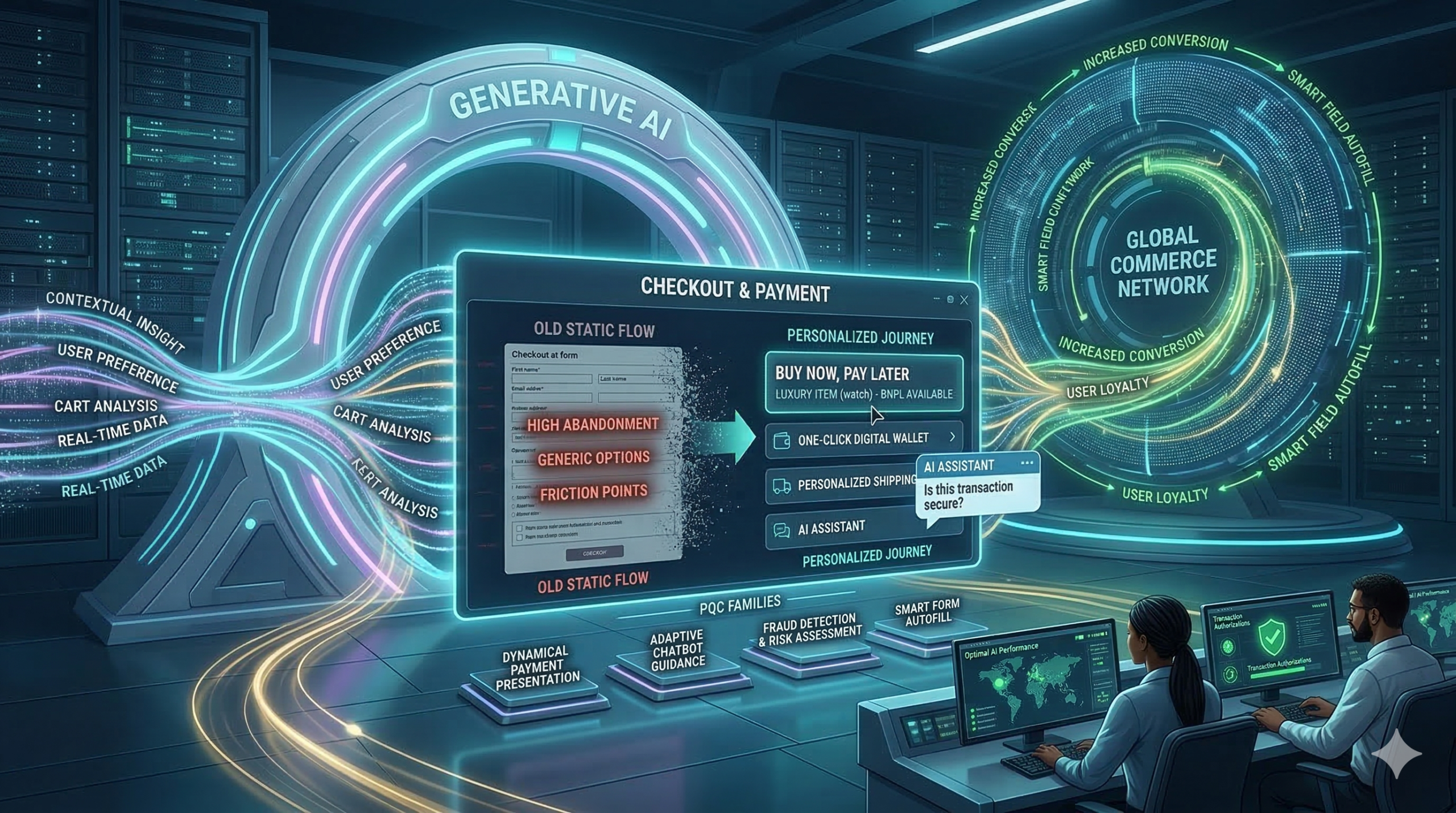
In the competitive world of e-commerce, getting a customer to add an item to their cart is a major achievement. However, the true measure of success lies in guiding that customer smoothly through the checkout process to a completed purchase. Unfortunately, high cart abandonment rates—often hovering around 70%—show that the checkout experience is a significant bottleneck. Clearly, a poorly designed checkout is simply a silent killer of sales, frustrating customers and forfeiting hard-earned revenue. Therefore, learning how to design a high-converting checkout experience is not optional; instead, it is a crucial discipline for any business focused on maximizing its conversion rate and driving substantial growth.
Many businesses spend vast amounts on traffic generation and product optimization but overlook the final, critical hurdle: the checkout page. They treat it as a necessary evil, failing to realize it is the single most important moment for trust and commitment. Consequently, any friction, confusion, or lack of security signals can cause a customer to abandon their purchase at the last second.
Always remember, the objective of the checkout experience is to be invisible—it should be so seamless and trustworthy that the customer focuses only on the value of their purchase, not the effort required to complete the transaction. By following best practices focused on simplicity, transparency, and trust, you can transform your checkout from a conversion bottleneck into a powerful sales accelerator.
The Cart Abandonment Crisis: Understanding the Problem
To begin with, we must acknowledge the severity of the cart abandonment crisis. Statistics consistently show that a large majority of potential customers leave their carts before completing a purchase. Clearly, understanding the primary reasons why customers abandon their carts is the essential first step in designing a better, more effective checkout. Truly, a high abandonment rate signifies deep-seated problems within your purchasing funnel, demanding immediate and strategic attention. Therefore, analyzing these common pain points will inform your design decisions.
Top Reasons Why Customers Abandon Checkout
Naturally, customers abandon carts for a multitude of reasons, but several key factors repeatedly surface in research:
Unexpected Costs: Hidden fees, high shipping costs, or unexpected taxes revealed late in the process often shock and deter buyers. Transparency is key.
Forced Account Creation: Requiring customers to register an account before purchasing creates friction and adds unnecessary steps, leading many to drop off.
Complex or Long Process: Too many steps, confusing forms, or an unclear progress indicator overwhelms the user. Simplicity is always superior.
Security Concerns: A lack of visible trust badges or an insecure-feeling page makes customers nervous about entering sensitive payment information. Trust signals are non-negotiable.
Lack of Payment Options: Not offering the customer’s preferred payment method can immediately stop a transaction. Flexibility is vital.
Furthermore, issues like slow page loading times, poor mobile optimization, and confusing navigation also contribute significantly to cart abandonment. Truly, by systematically addressing these pain points in your design, you can eliminate friction and create a checkout experience that systematically guides the user toward a successful conversion.
Step 1: Simplify the Process – The Power of Minimal Steps
One of the most effective strategies for reducing cart abandonment is radical simplification. Clearly, the fewer clicks and the less data entry required from the customer, the higher your conversion rate will likely be. Therefore, your design goal should be to minimize cognitive load and eliminate any non-essential steps between the shopping cart and the confirmation page. Truly, an efficient checkout process is a fast checkout process.
Optimizing Flow and Reducing Friction
Firstly, offer a guest checkout option prominently. Forcing account creation is one of the top reasons for abandonment. Allow customers to complete their purchase quickly, and then offer an easy, post-purchase option to create an account (e.g., “Save your details for next time!”). This reverses the friction point effectively.
Secondly, aim for a one-page or accordion checkout design. While a multi-step checkout with a clear progress bar can work, condensing all necessary information onto a single, vertically scrolling page often reduces the perception of effort. If using multiple steps, limit them to three or four logical phases (e.g., Shipping, Payment, Review). Furthermore, auto-fill and smart form fields are non-negotiable time-savers. Use features like address lookup tools that auto-suggest addresses after a few keystrokes. Integrate validation tools that check data accuracy in real-time. Also, automatically fill billing details with shipping information if the customer chooses that option. Truly, every keystroke saved is friction removed, smoothing the path to a higher conversion rate.
Step 2: Build Trust and Ensure Security Signals
Checkout involves customers sharing highly sensitive personal and financial information. Therefore, trust and security are foundational elements of a high-converting experience. Clearly, if a customer feels uneasy or insecure on your payment page, they will leave, regardless of how great your product is. Therefore, designing a checkout that looks secure and feels trustworthy is absolutely essential for conversion success.
Visible Indicators of Safety and Credibility
Firstly, ensure your website uses HTTPS and an SSL certificate. While standard practice, explicitly display a padlock icon and verify the secure URL (starting with https://). This basic technical requirement is a fundamental trust signal. Secondly, display recognizable trust badges and security seals prominently near the payment fields. Logos from security providers (e.g., Norton, McAfee, Trustpilot) or payment gateways (e.g., PayPal Verified) instantly reassure customers about data protection. Truly, these visual cues act as powerful psychological validators.
Furthermore, clearly communicate your refund, return, and privacy policies near the final purchase button. A link to your full policy is often necessary, but a concise summary of your guarantee can significantly boost confidence. Also, ensure your customer support information is readily accessible on the checkout page (e.g., a phone number, live chat icon, or a clear link to FAQs). This demonstrates that a real company stands behind the transaction and offers assistance if needed. Always remember, trust is earned through transparency and visible security measures. By maximizing these trust signals, you mitigate customer anxiety and successfully guide them past the final moment of hesitation.
Step 3: Optimize Payment Flexibility and Transparency
A customer is ready to buy, but if you don’t accept their preferred method of payment or surprise them with high costs, the sale is lost. Consequently, optimizing payment flexibility and transparency are two critical areas that directly impact conversion rates. Clearly, offering choice reduces friction, while clear communication prevents buyer shock. Therefore, focus on maximizing options and upfront honesty.
Offering Choice and Maintaining Price Integrity
Firstly, provide a variety of widely accepted payment methods. Beyond major credit cards (Visa, Mastercard, Amex), integrate popular digital wallets (e.g., Apple Pay, Google Pay, PayPal) and local payment options relevant to your target markets. Also, consider offering Buy Now, Pay Later (BNPL) options (e.g., Klarna, Affirm), as these have become highly popular for managing expenses and often increase the average order value. Flexibility caters to diverse customer preferences globally.
Secondly, prioritize price transparency. This is crucial. Display all costs, including shipping fees, taxes, and any other charges, as early as possible—ideally on the product page or within the shopping cart summary, not just on the final checkout page. Clearly label the different shipping options and their associated costs and delivery timelines. Furthermore, use an always-visible order summary throughout the checkout process. This summary should dynamically update as the customer adds items or selects shipping options, constantly reminding them of their total commitment. Truly, eliminating the fear of hidden fees and offering convenient payment options removes the final financial barriers, resulting in a higher likelihood of conversion.
Step 4: Ensure Flawless Mobile and Performance Optimization
In 2025, mobile devices account for the majority of e-commerce traffic. Therefore, a failure to optimize your checkout experience for mobile users is equivalent to turning away more than half of your potential sales. Clearly, a truly high-converting checkout must be flawlessly responsive, fast-loading, and intuitive on screens of all sizes. Therefore, prioritizing mobile optimization and site speed is absolutely essential for maximizing your conversion rate.
Speed, Responsiveness, and Mobile-First Design
Firstly, design your checkout process using a mobile-first philosophy. This means prioritizing large, easy-to-tap buttons, simple one-column layouts, and minimal form fields that leverage mobile keyboard features (e.g., automatic number input for card details). Test the entire flow rigorously on various mobile devices to ensure all elements are accessible and functional. Furthermore, minimize text input on mobile. Use radio buttons, dropdown menus, and address lookup tools to reduce typing, which is cumbersome on small screens.
Secondly, optimize the page loading speed relentlessly. Slow checkout pages are a primary driver of abandonment, as customers lose patience quickly. Compress images, minimize unnecessary scripts, and use efficient hosting. Aim for checkout pages that load in under two seconds. Also, ensure that all error messages are clear and immediate. If a form field is filled incorrectly, provide instant, visible feedback to the user on how to correct the error, rather than waiting for the customer to hit “submit” and then forcing them to navigate back. Truly, by ensuring a fast, responsive, and friction-free mobile experience, you capture the vast majority of today’s e-commerce traffic, significantly boosting your conversion rate.
Step 5: Leverage Data and Post-Purchase Opportunities
A high-converting checkout is not a set-it-and-forget-it asset; instead, it is a constantly evolving system driven by data and continuous testing. Furthermore, the checkout is not truly over until the customer receives their product and is encouraged to return. Clearly, leveraging post-purchase moments for customer engagement is a smart strategy to build loyalty and increase the Customer Lifetime Value (CLV). Therefore, focus on data analysis and strategic follow-up.
A/B Testing, Analytics, and Post-Purchase Nurturing
Firstly, use analytics to identify specific drop-off points. Tools like Google Analytics, heat maps, and session recordings can show exactly where users hesitate, click away, or abandon forms. Pinpoint the problematic step or field—is it shipping calculation, the credit card field, or the final button? This data should directly inform your optimization efforts. Secondly, conduct rigorous A/B testing. Test everything: the number of steps, the wording on buttons (e.g., “Buy Now” vs. “Place Order”), the placement of trust badges, and the presence of guest checkout. Small changes based on data can lead to massive conversion uplifts.
Furthermore, optimize the confirmation page and email as marketing opportunities. The confirmation page should reassure the customer, display their order summary clearly, and offer immediate next steps (e.g., track order, download app). The confirmation email should be prompt, reiterating trust signals and providing essential details. Lastly, implement cart abandonment recovery emails. These automated emails, sent within hours of abandonment, can successfully bring back a significant portion of lost customers by offering a gentle reminder or sometimes a small incentive. Truly, by viewing checkout as a system of continuous improvement and leveraging the post-purchase experience, you not only increase conversions today but also secure customer loyalty for tomorrow.
Frequently Asked Questions (FAQs)
Q1: What is the single most effective way to immediately reduce cart abandonment?
The single most effective way to immediately reduce cart abandonment is offering a clear, prominent guest checkout option. Removing the friction and requirement of forced account creation allows the customer to complete their purchase quickly, which directly addresses one of the top reasons for drop-off.
Q2: How many steps should an optimal checkout process have?
While there is no fixed number, the optimal checkout process should minimize the perceived effort. Ideally, aim for a single-page checkout or a maximum of three to four highly consolidated steps (e.g., Shipping, Payment, Review). The key is clear progress indicators and minimal form fields.
Q3: Why is mobile optimization more critical than desktop optimization for checkout?
Mobile devices now account for the majority of e-commerce traffic. If your checkout is slow, requires tedious typing, or has small buttons on mobile, you risk losing the largest segment of your potential customers. A mobile-first, fast-loading, responsive design is essential for modern conversion rates.
Q4: How important are trust badges on the checkout page?
Trust badges are extremely important. They act as visible, psychological validators that reassure customers your site is secure enough to handle their sensitive financial information. Placing well-known security seals and payment gateway logos near the payment fields significantly boosts customer confidence and reduces security-related abandonment.
Q5: What should I A/B test first on my checkout page?
Start by A/B testing elements related to friction and anxiety. This includes testing: the presence/placement of trust badges, offering or removing guest checkout, the wording of the final purchase button CTA, and the layout (one-page vs. multi-step). Use analytics to guide your choices and maximize impact.