Online shoppers hesitate more than business owners realize. A single moment of doubt at checkout can cost a sale. This is exactly where trust signals make a difference.
Trust signals are small cues that tell shoppers a website is safe. They include security badges, reviews, and clear payment icons. Together, these cues directly influence payment completion rates.
Many online stores lose customers right before the final click. Shoppers fill their carts, then suddenly leave. Often, the missing piece is trust, not price or product quality.
Picture a shopper reaching checkout on an unfamiliar site. They like the product, but something feels uncertain. A missing badge or vague payment process can end the purchase instantly.
This guide explains why trust signals matter so much during checkout. You will learn which signals work best and how to use them. By the end, you will understand how to turn hesitant visitors into paying customers.

What Are Trust Signals and Why Do They Matter
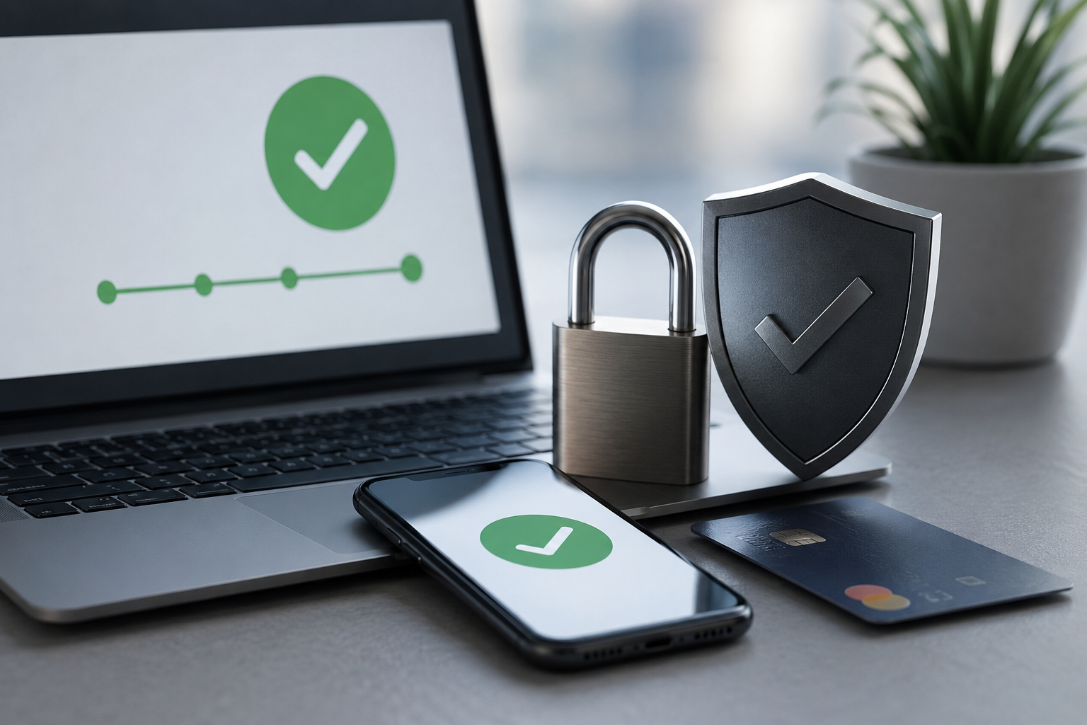
Trust signals are visual or written cues that build buyer confidence. They reassure shoppers that a website is legitimate and secure. Common examples include SSL badges, customer reviews, and recognizable payment logos.
Shoppers rarely read every word on a checkout page. Instead, they scan quickly for signs of safety. A missing security badge or unclear payment method can trigger doubt instantly.
This doubt often leads to cart abandonment. Studies consistently show that unclear security is a top reason shoppers leave. Trust signals reduce this risk by addressing concerns before they grow.
Payment completion rates depend heavily on perceived safety. Shoppers want to know their card details are protected. A simple lock icon near the payment field can ease that worry significantly.
Trust signals also work psychologically. People naturally look for proof before committing to a decision. Online shopping is no different from offline trust-building in this sense.
A handshake or familiar storefront once reassured customers in person. Today, trust signals serve that same purpose online. They replace the missing physical reassurance shoppers used to rely on.
This matters even more for first-time visitors. Returning customers already trust your brand from past experience. New visitors, however, judge everything within seconds of arriving.
Trust signals work differently across industries too. A jewelry store may need stronger security messaging than a stationery shop. Higher-priced items naturally trigger more caution from shoppers.
Age and shopping habits also play a role. Some shoppers check for security badges automatically out of habit. Others simply feel uneasy without knowing exactly why, until something reassures them.
How Trust Signals Influence Payment Completion Rates
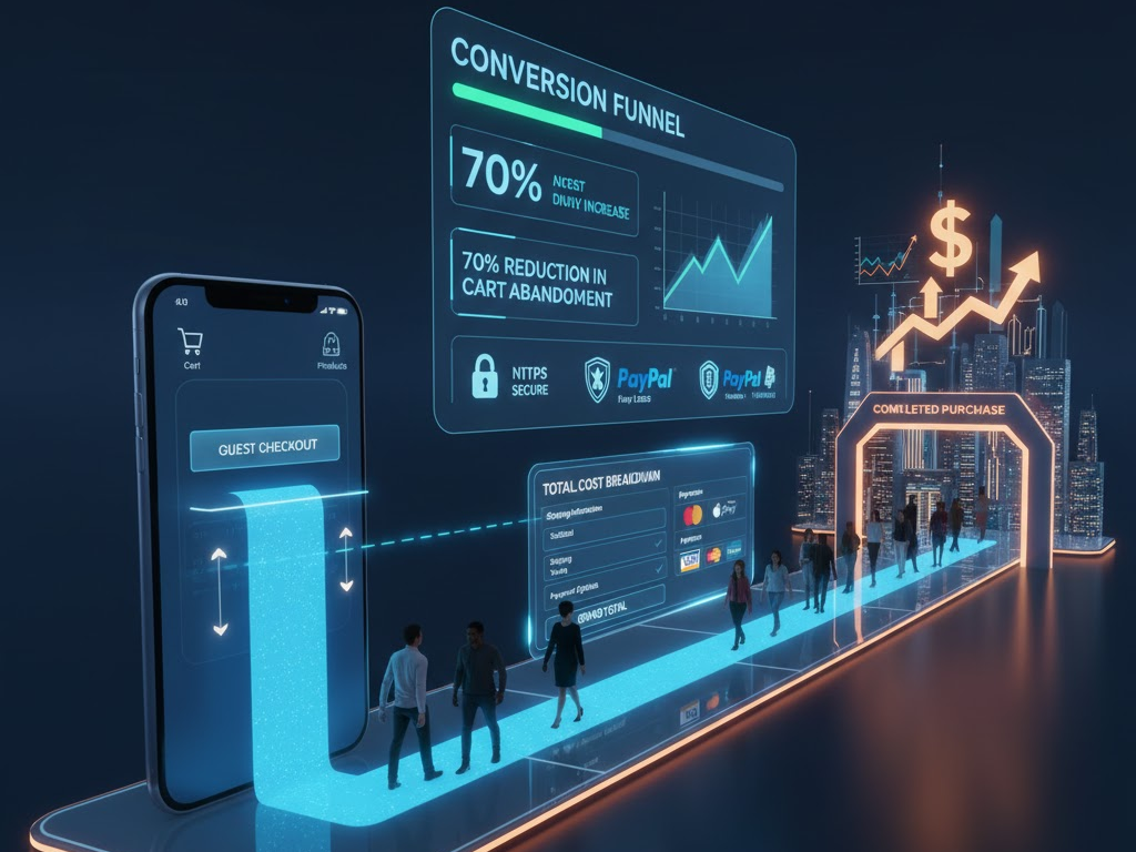
Payment completion rates measure how many shoppers finish their purchase. Trust signals directly affect this number at nearly every stage. Even small design choices can shift completion rates noticeably.
Displaying secure checkout badges near payment fields, for example, reduces hesitation. Shoppers feel reassured when they see recognizable security symbols. This small detail often leads to fewer abandoned carts.
Customer reviews also act as powerful trust signals. Seeing other buyers’ positive experiences reduces uncertainty. New customers feel more comfortable completing their purchase as a result.
A single detailed review can outweigh pages of marketing copy. Shoppers trust peer experiences over brand claims. Genuine feedback carries weight that polished sales language cannot match.
Clear return policies serve a similar purpose. Shoppers want to know they can get a refund if needed. This safety net often pushes hesitant buyers toward completing payment.
Trust badges from recognized payment providers matter too. Logos like Visa, Mastercard, or PayPal signal legitimacy instantly. Shoppers trust these brands, and that trust transfers to your store.
Site design plays a role as well. A professional, clean checkout page feels safer than a cluttered one. Visual consistency throughout the buying journey reinforces trust at every step.
Mobile shoppers are especially sensitive to trust signals. Smaller screens leave less room for error or confusion. Clear, simple trust cues become even more important on mobile devices.
Page load speed influences trust too, though it is often overlooked. Slow checkout pages feel unreliable, even when security is solid. Fast, smooth performance quietly reinforces every other trust signal on the page.
Checkout length matters in a similar way. Long forms with unnecessary fields create friction and doubt. Shorter, well-organized checkout flows feel safer and more trustworthy overall.
Types of Trust Signals That Improve Checkout Conversions
Several types of trust signals work together to improve payment completion. Understanding each type helps you apply them effectively. Let us look at the most impactful ones.
Security badges are among the most recognized trust signals. SSL certificates and secure checkout icons reassure shoppers instantly. These badges should appear near payment fields, not buried in footers.
Customer reviews and testimonials build social proof. Shoppers trust other buyers more than marketing copy. Displaying reviews near product pages and checkout pages strengthens buyer confidence.
Video testimonials can add even more weight than written ones. Seeing a real customer speak feels more authentic. This extra layer of credibility can ease last-minute checkout doubts.
Transparent pricing is another important trust signal. Hidden fees that appear at checkout frustrate shoppers instantly. Clear, upfront pricing prevents last-minute surprises that cause cart abandonment.
Recognizable payment logos also matter greatly. Shoppers feel safer paying through familiar platforms. Offering multiple trusted payment options increases the likelihood of completed purchases.
Contact information builds trust as well. A visible phone number or live chat option reassures shoppers. It signals that real people stand behind the business.
Trust seals from third-party security companies add another layer. Norton, McAfee, and similar seals are widely recognized. Shoppers associate these seals with safety, even without understanding the technical details.
Clear refund and shipping policies round out the list. Shoppers want predictability before paying. Transparent policies reduce anxiety and support higher payment completion rates.
Finally, consider adding trust signals tied to your industry specifically. Healthcare sites benefit from privacy certifications, while finance sites benefit from regulatory disclosures. Matching signals to industry expectations builds even stronger credibility.
Social media presence can function as a trust signal too. An active, responsive account shows shoppers that a real business stands behind the storefront. Silence or inactivity, in contrast, can quietly raise doubts.
Best Practices for Using Trust Signals Effectively
Adding trust signals randomly rarely produces strong results. Strategic placement and consistent messaging matter more than quantity. Businesses should follow a few key best practices, therefore, before adding anything new.
Place trust signals near the payment button itself first. This is where hesitation peaks. Security badges placed here reduce last-minute doubts effectively.
Avoid overcrowding the page with too many badges. Too many logos can look unprofessional or even suspicious. A few well-placed, recognizable signals work better than dozens of small icons.
Update trust signals regularly to maintain credibility. Outdated certificates or broken badge links damage trust instantly. Regular audits ensure all signals remain accurate and functional.
Highlight genuine customer reviews whenever possible. Fake or exaggerated testimonials can backfire if shoppers sense inauthenticity. Authentic feedback builds stronger, longer-lasting trust.
Test different placements and combinations of trust signals. A/B testing reveals what resonates most with your specific audience. Data-driven adjustments often improve payment completion rates significantly.
Small changes can produce surprisingly large results. Moving a badge a few inches, or rewording a guarantee, can shift behavior. Testing removes guesswork from these decisions entirely.
Gathering shopper feedback directly can also help. A short survey asking why someone abandoned a cart often reveals trust gaps. This direct insight is sometimes more valuable than any analytics dashboard.
Mobile optimization deserves special attention as well. Trust signals must remain visible and clear on smaller screens. A cluttered mobile checkout page undermines even the strongest trust signals.
Consistency across your website strengthens overall credibility. Mismatched branding or inconsistent messaging creates subtle doubt. A cohesive experience reassures shoppers at every step of their journey.
Conclusion
Trust signals play a critical role in payment completion rates. From security badges to customer reviews, these small cues reduce hesitation and build confidence. Businesses that prioritize trust signals often see meaningful improvements in checkout conversions.
Implementing trust signals does not require a complete website overhaul. Small, strategic changes can produce noticeable results quickly. As online shopping continues to grow, trust signals will remain essential for converting visitors into loyal customers.
Start by reviewing your own checkout page with fresh eyes. Notice where you, as a shopper, might hesitate. That small exercise often reveals exactly where trust signals are needed most.
Trust is earned in seconds and lost just as quickly online. A thoughtful approach to trust signals protects every sale you have worked hard to earn.
Treat trust signals as an ongoing part of your store, not a one-time task. Markets change, and shopper expectations shift along with them. Regular attention keeps your checkout experience credible for years to come.
Frequently Asked Questions
- What are trust signals in online payments?
Trust signals are visual or written cues, such as security badges and reviews, that reassure shoppers during checkout. - How do trust signals improve payment completion rates?
Trust signals reduce shopper hesitation by addressing security and legitimacy concerns before checkout is completed. - Where should trust signals be placed on a website?
Trust signals work best near payment fields, checkout buttons, and product pages where hesitation typically occurs. - Can too many trust signals hurt conversions?
Yes. Overcrowding a page with badges can appear unprofessional and reduce, rather than build, buyer confidence. - Are customer reviews considered trust signals?
Yes. Customer reviews act as social proof and are one of the most effective trust signals available.
Read More:
How to Stop Payment Latency From Hurting Revenue